DuPont

Innovating an iconic industrials leader
Spanning two centuries, DuPont has fueled some of the world’s greatest achievements and transformed the way we live.
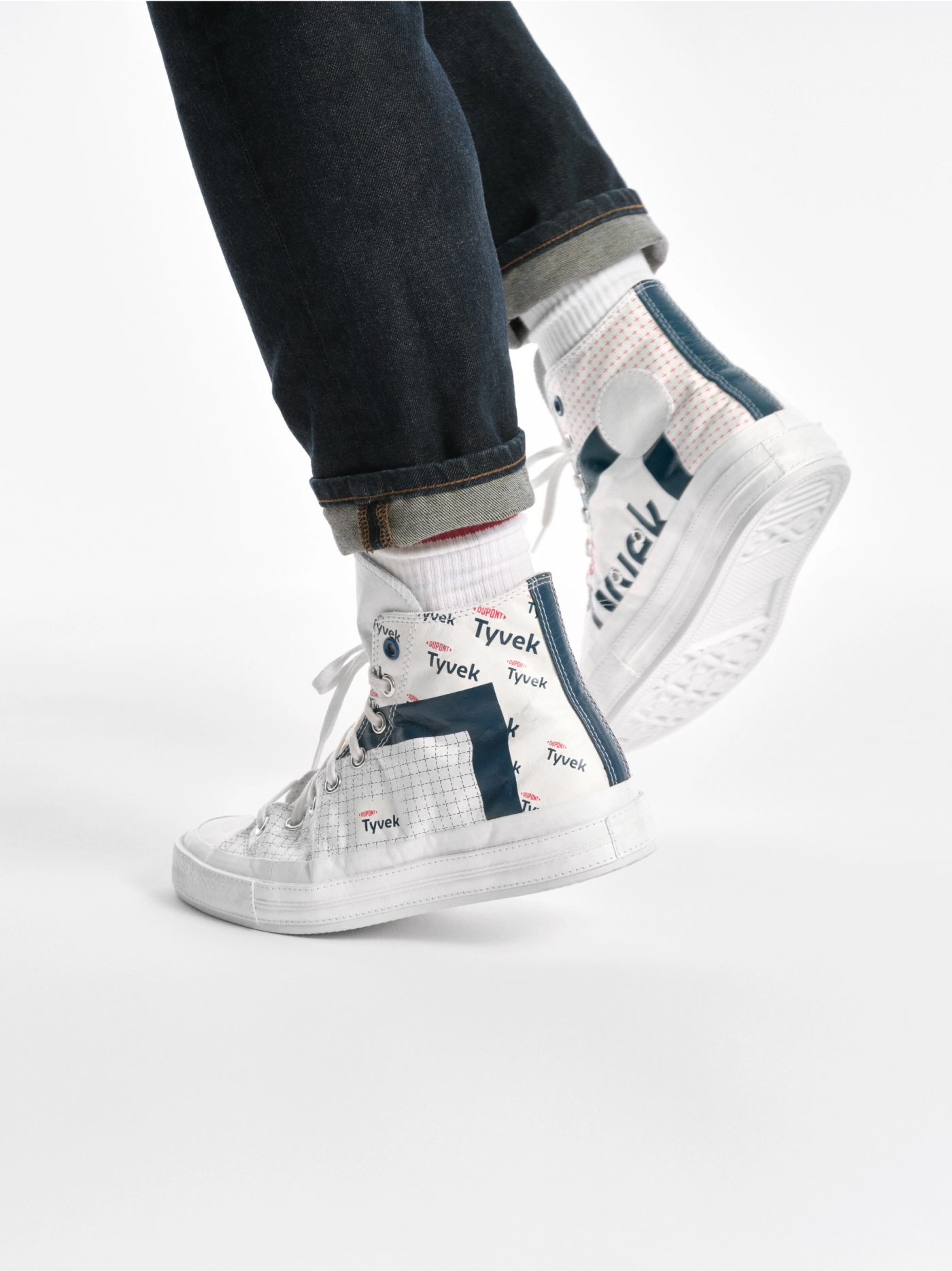
The names are familiar – from Kevlar and Tyvek to Corian, Sorona and Danisco. And while much has changed in 200 years, the company remains committed to scientific rigor, engineering prowess and a constant curiosity to deeply understand and create for the needs of an ever-changing world.
When Dow and DuPont merged in 2017 the plan was to integrate their complementary portfolios before spinning them off into distinct publicly traded companies. By 2019, three new market leading companies focused on Materials Science, Agriculture and Specialty Products will emerge. The Specialty Products division was set to become the new DuPont.
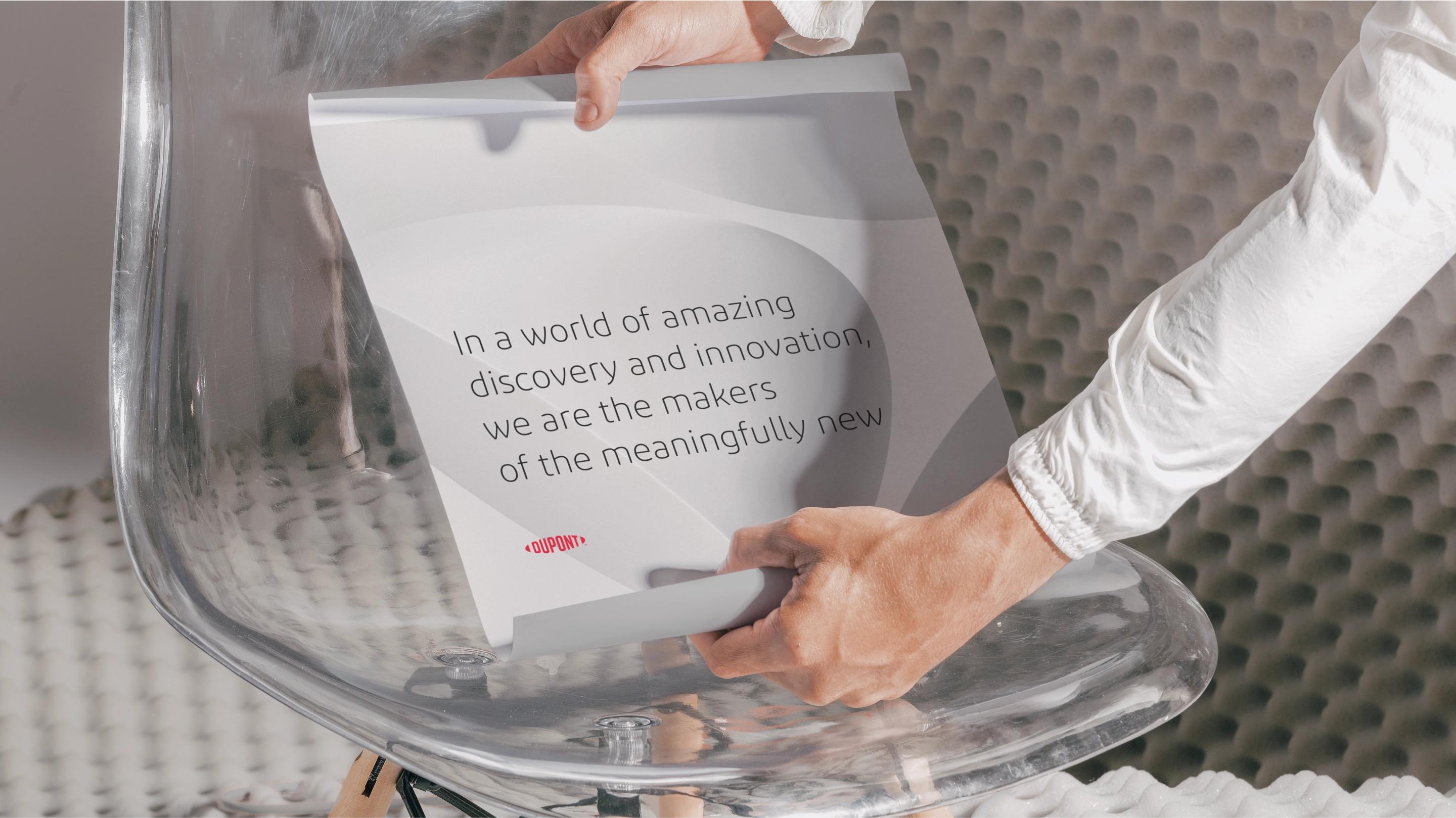
Lippincott was engaged to help define Dupont’s new chapter. We began by developing a set of brand commitments and design principles that would bring their purpose statement to life, honoring the past while pointing energetically to a future fueled by life-enhancing innovations.
Embracing an icon
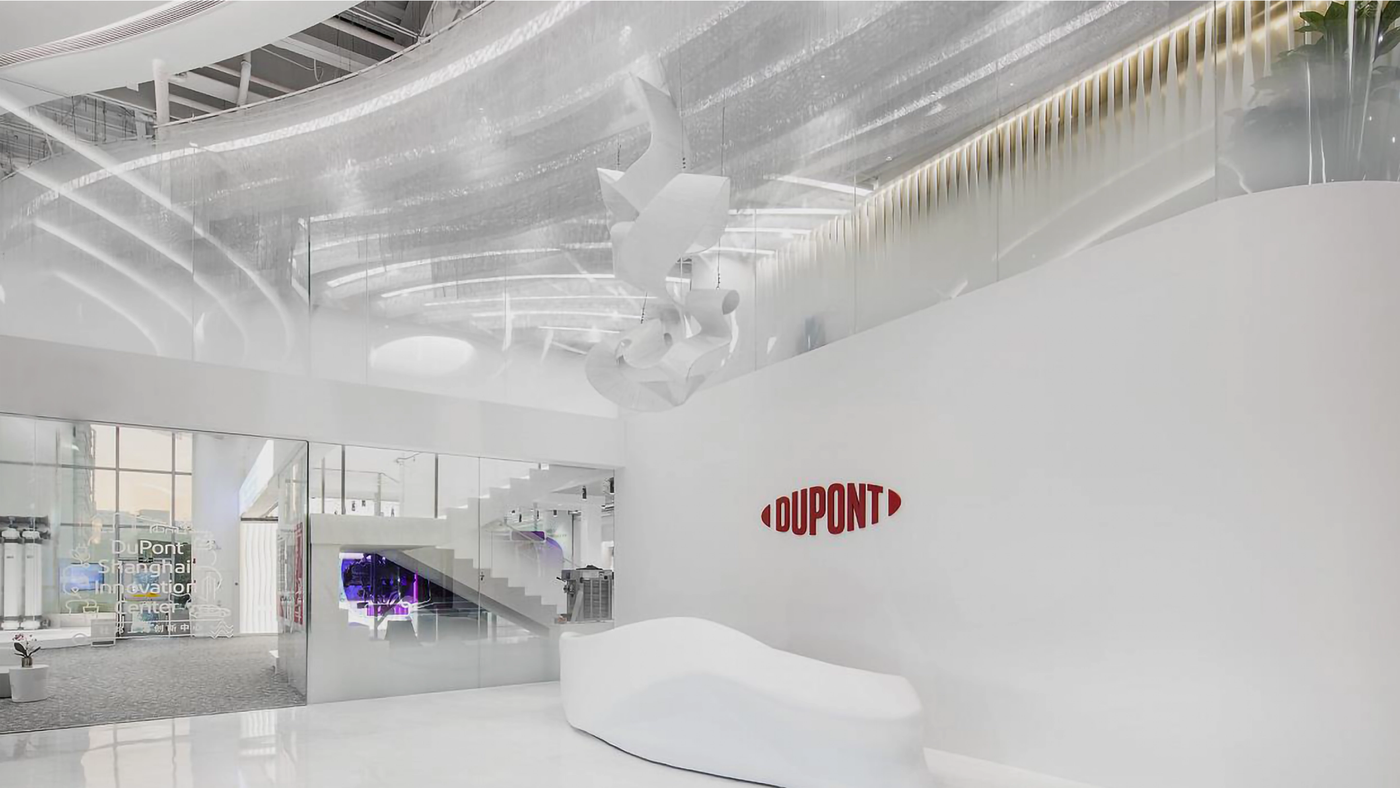
The DuPont logo is one of the oldest and most iconic corporate marks in contemporary culture. It has endured wars, economic upheavals, and technological transformations. Because the distinctive oval has remained virtually untouched since 1906, Lippincott approached the challenge with great respect for the equity of the classic mark.
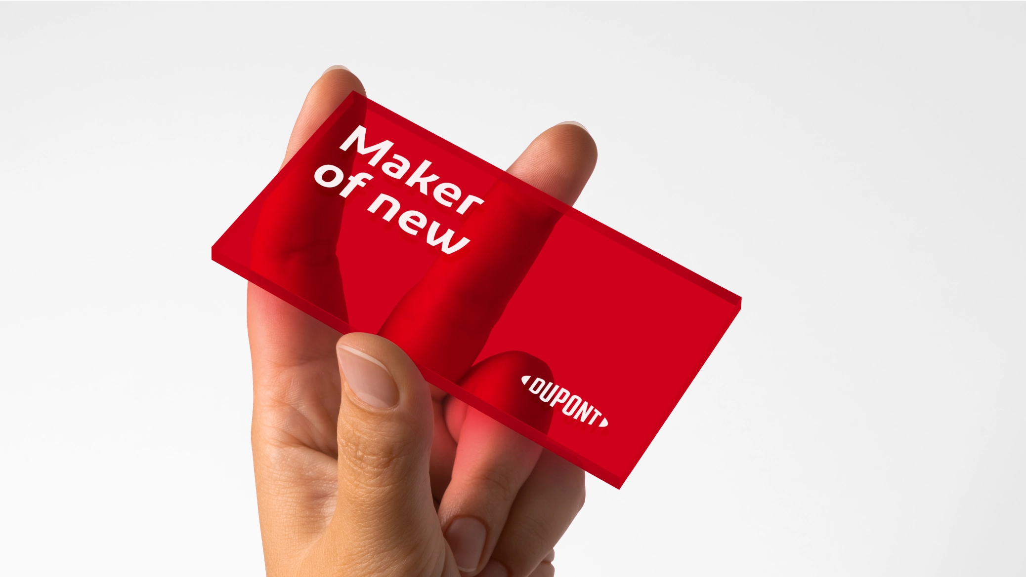
The new mark features a simplified name that unites “Du Pont” into one word. We embraced the name with an all-new typographic design that expresses a bold, contemporary attitude. And by opening the oval, the mark now signals a collaborative and open flow of ideas and innovation.
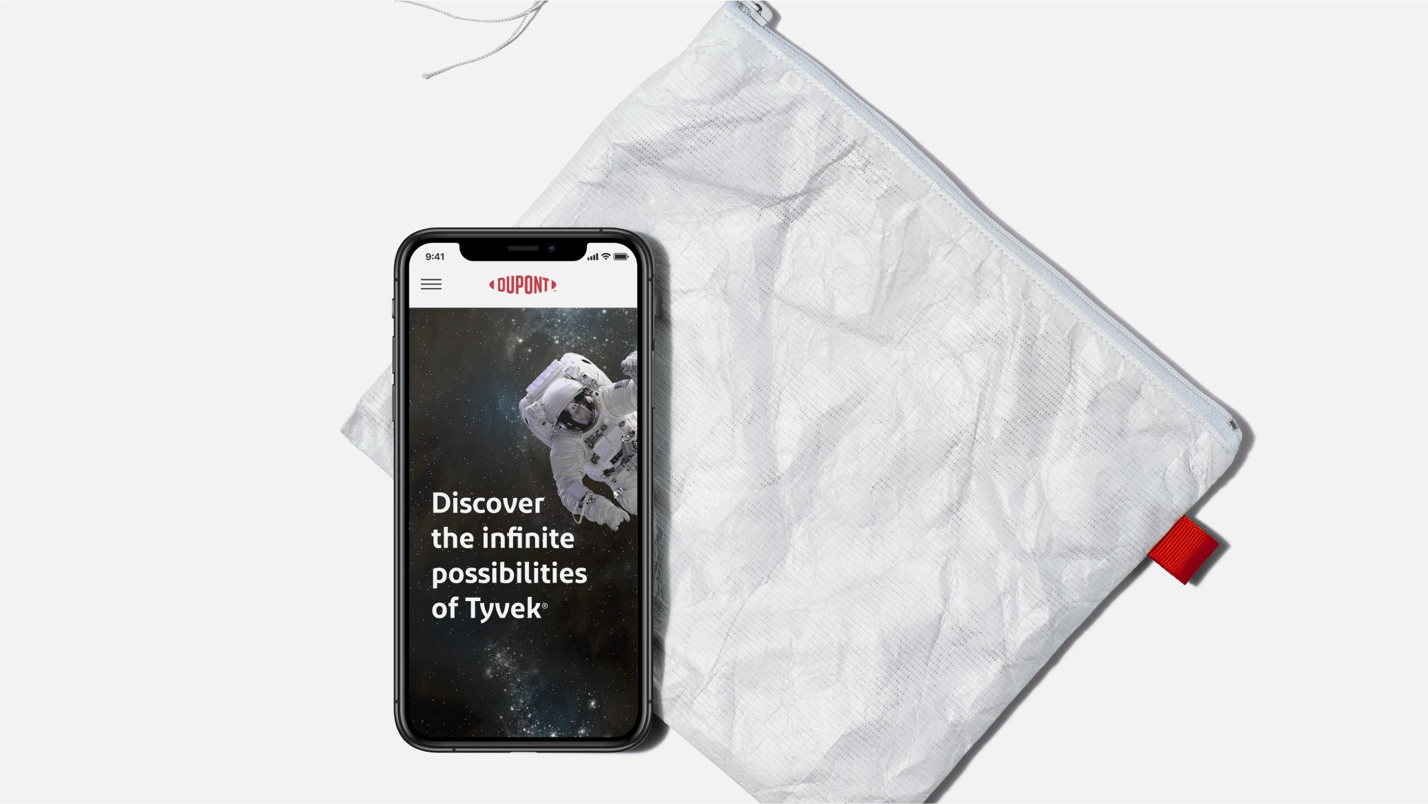
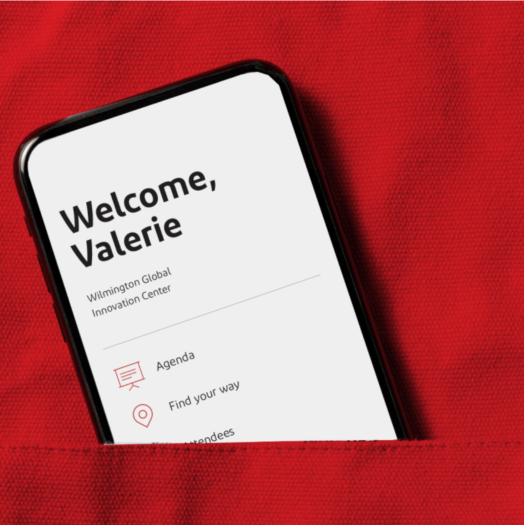
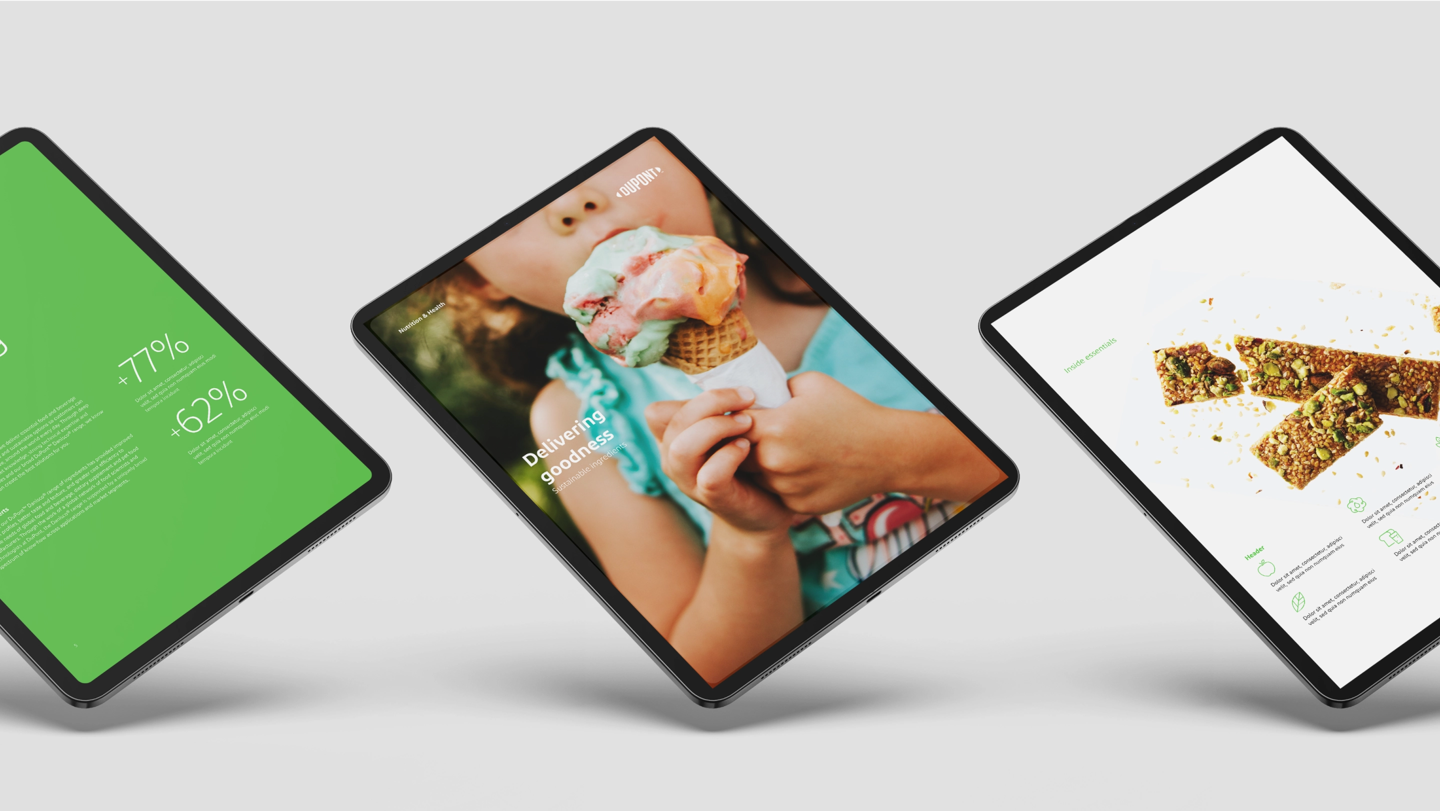
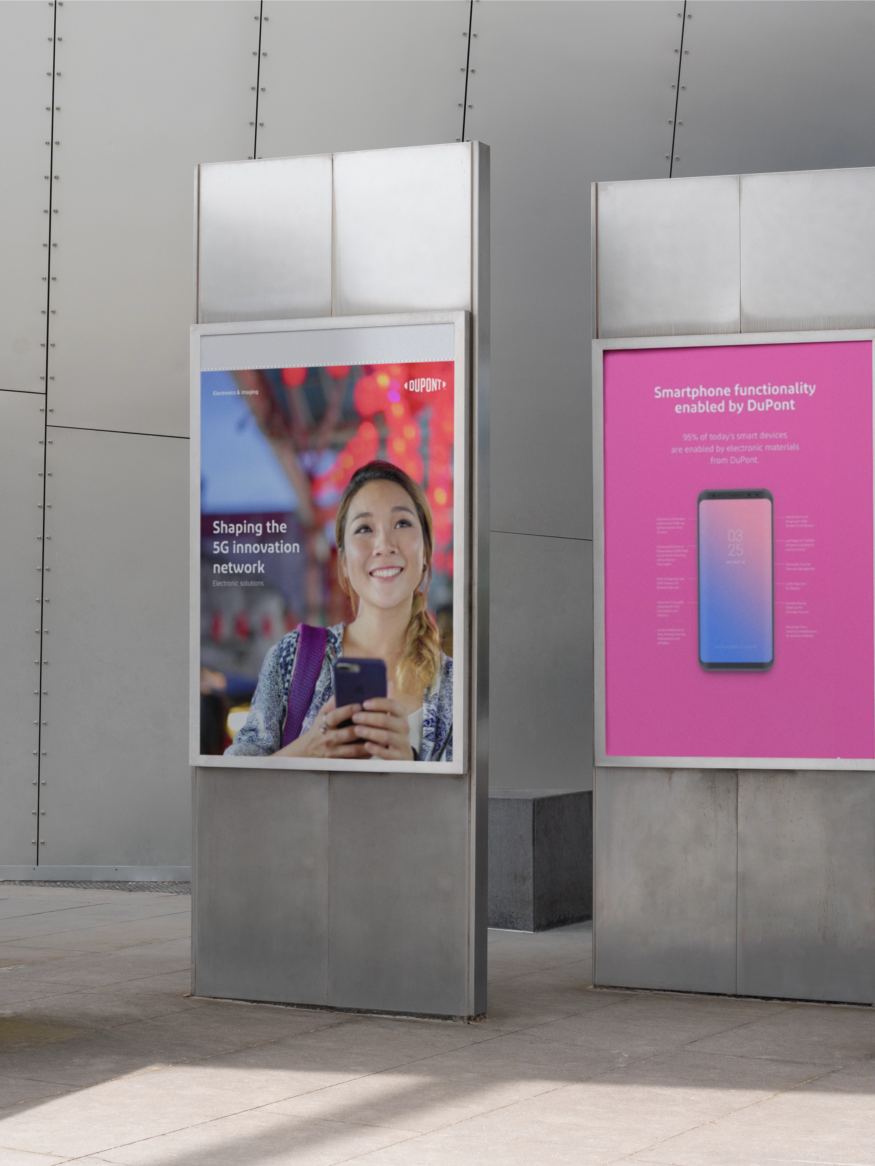
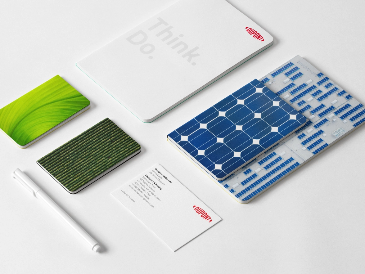
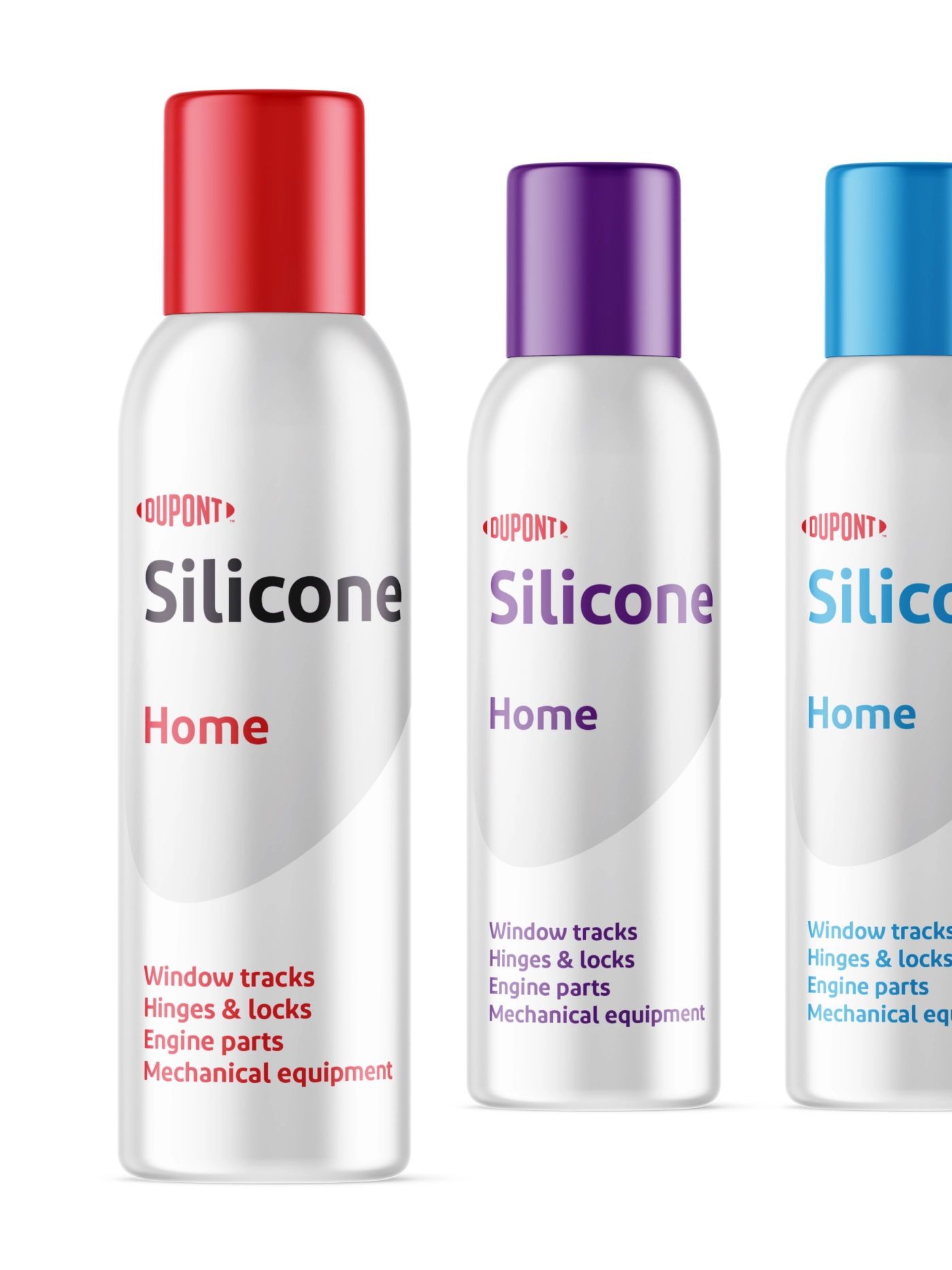
The new design system is similarly bold, open and vibrant. Imagery spans macro impact to micro essentials. The brighter DuPont Red is supported by a vibrant and diverse color palette. The DuPont typeface balances crisp edges and rounded curves to make it feel both precisely engineered and approachably warm. The oval and end-to-end logo graphics add a rich visual texture to the identity system.
Equipped for growth
Armed with new capabilities, a bold new brand, and a revitalized design, DuPont continues to bring life-changing innovations to a changing world. From wearable electronics to autonomous transportation, the company proudly holds its rightful position as the market leader in industrial transformation.