


PBS
在数字时代的洪流之中重振PBS
A changing market for an industry stalwart
For half a century, Americans have welcomed PBS into their homes, transforming their televisions into history lessons and cooking classes, into National Parks and Great Performances. However, the brand’s context was shifting dramatically through increased competition, changing needs of viewers and donors, and the explosion of digital platforms available to access video content.
With multiple visual expressions of the brand across its 330 local member stations and third-party streaming platforms, PBS needed not just a surface-level revitalization, but a deep transformation to create greater consistency in a rapidly changing viewer and media landscape.
So PBS came to Lippincott with an ask: evolve its brand to help it compete for viewer attention, engagement, and loyalty across all channels. Develop a new brand purpose and platform, brand architecture, visual identity, voice, and activation strategy to revitalize this beloved brand.
Clarity of purpose
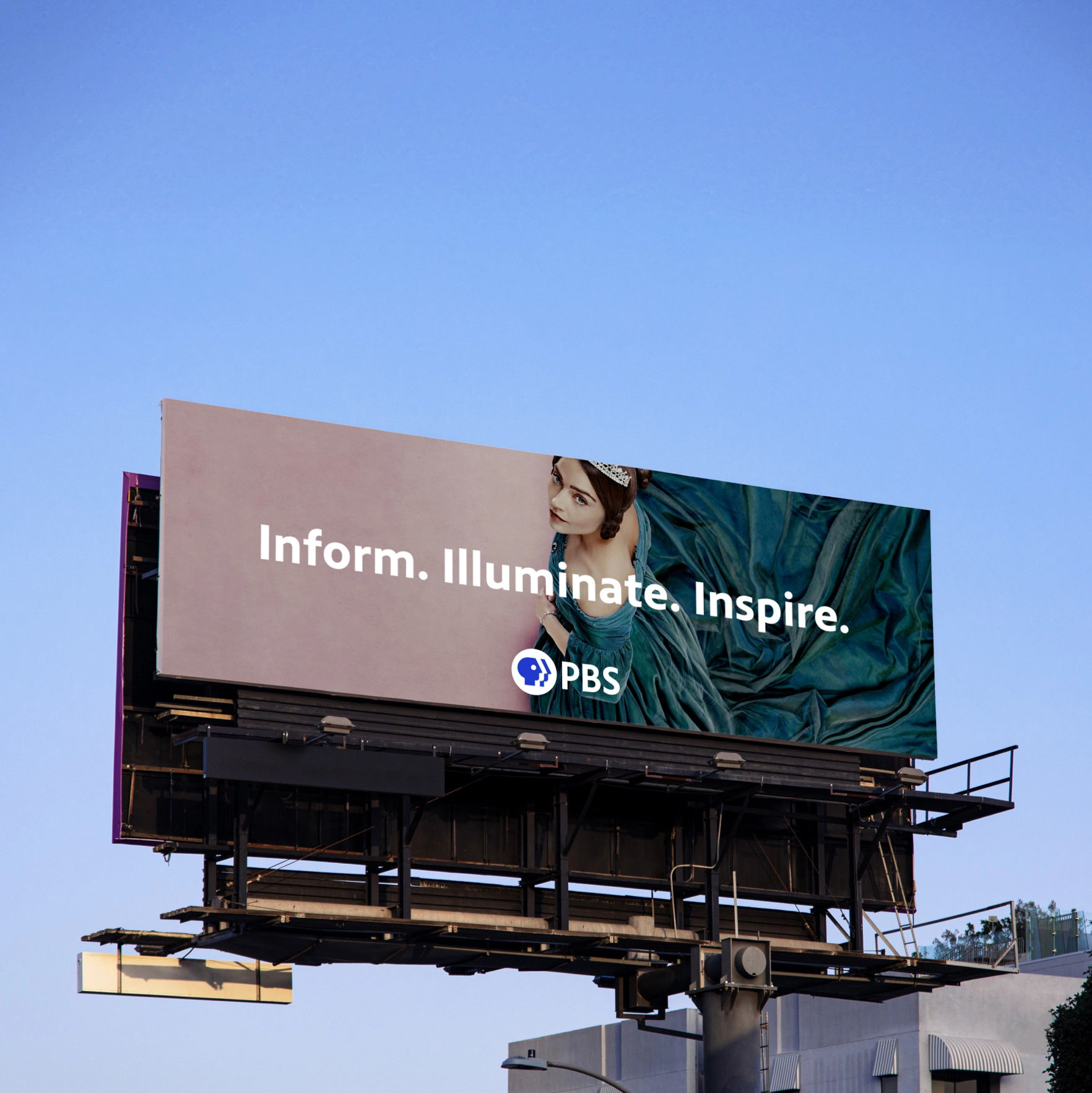
The new brand platform is centered on a powerful purpose—to be the beacon of thoughtful and thought-provoking media, bringing light and trust in a media landscape characterized by fragmentation and sensationalism. To ensure every touchpoint furthered this purpose, we needed to create memorable brand cues in the visual identity and brand architecture that would help the brand stand out in a saturated market.

Evolving an icon
While the previous identity had incredibly strong equity with audiences, refinements would amplify its existing heritage and connect with viewers of all generations. The new logo boasts a vibrant blue and a more modern, clear, and relatable logotype. We softened the sharp geometric features of the original symbol, with a subtle upward gaze that feels more engaging. PBS Sans—the brand’s new proprietary typeface—is human, engaging, and highly legible across all platforms.
Supporting visual elements, like a distinct illustration style, evoke the logo’s human characteristics. Circular cues and movements across the identity system bring warmth, sophistication, and energy to the rigor and reason of PBS. The entire visual identity is bolder and projects a sense of trust and dependability to better showcase PBS as a curator and content provider. Combined, these visual elements highlight PBS programming and unify local and national communities across member stations.

Bringing the brand to life
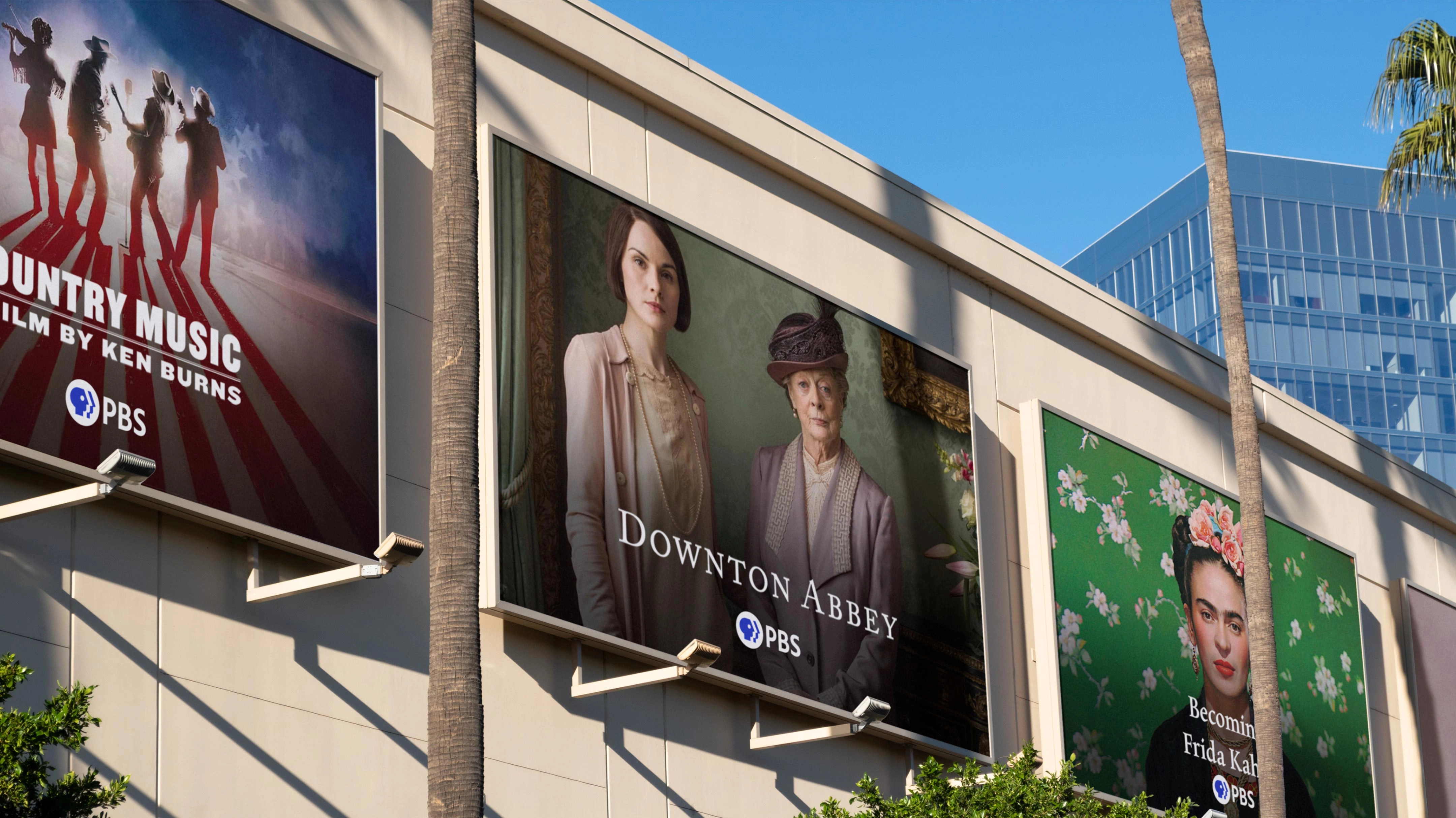
To activate the new strategy, we engaged the full PBS system—from internal departments and partners to far-flung stations—to ensure they understood the importance of a more consistent and assertive PBS brand presence, and how to implement it. For member stations, we developed a flexible range of solutions to adopt the new visual identity, strengthening their own stations as local hubs in an interconnected ecosystem.
As a result, over 70 percent of member stations are planning to adopt the new identity during their yearlong celebration of PBS’s 50th anniversary, a landmark achievement for the brand that will act as a springboard for future growth.
The new brand certainly revitalized the enduring strength of PBS.


.png.lippincott-transform/lippincott-orign/img.webp)